NobleNox Designs
Restaurant in Albania · Client work
Brio
The problem
The restaurant needed a brand that would be recognised instantly on the street, on social, and in a competitive local market. Existing visuals were not memorable enough to own attention.
My approach
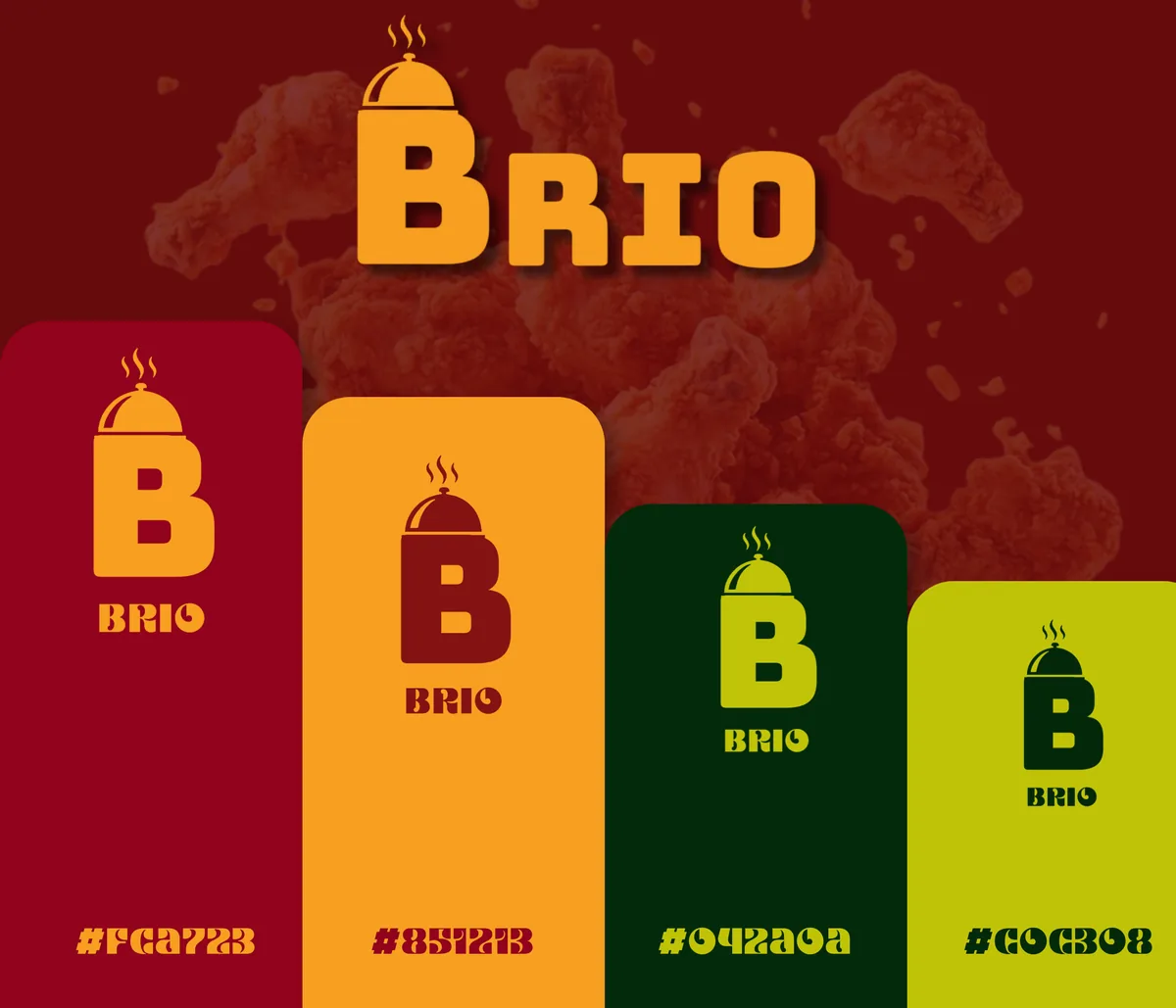
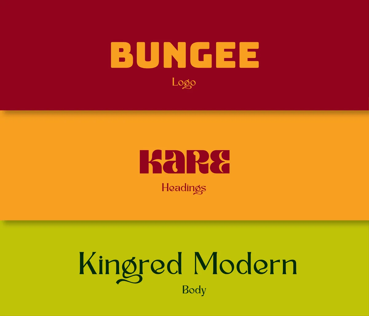
I researched colours that imprint quickly and carry psychological weight. Every element had to be noticeable, stand out, and still feel premium. A deep red became the primary signal. The Bungee typeface was chosen for its bold, slightly playful structure that felt food-related without becoming cartoonish.
The result
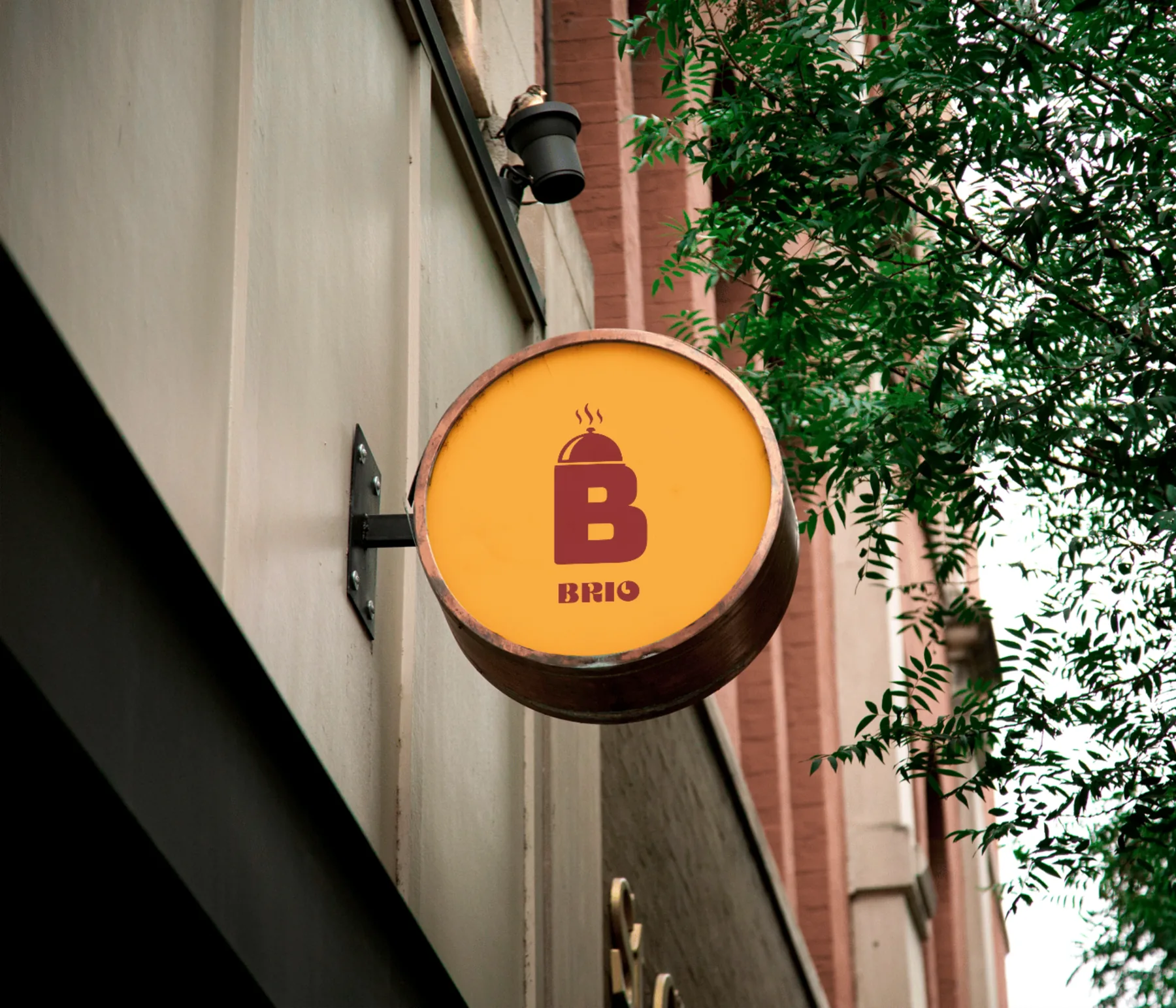
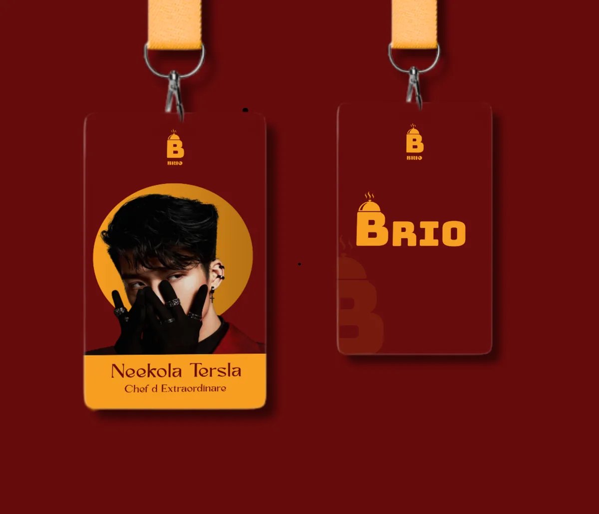
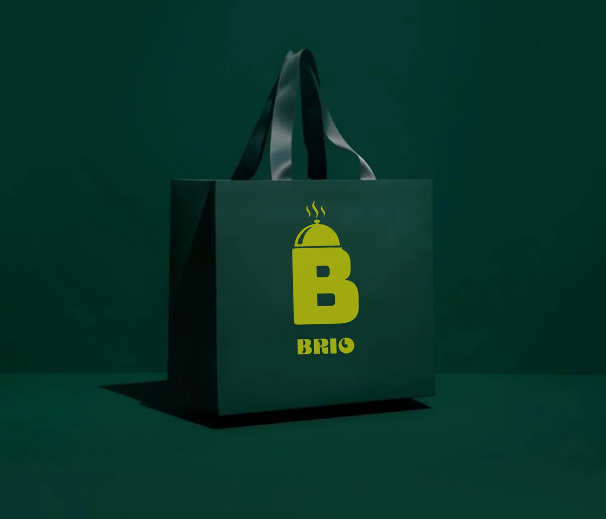
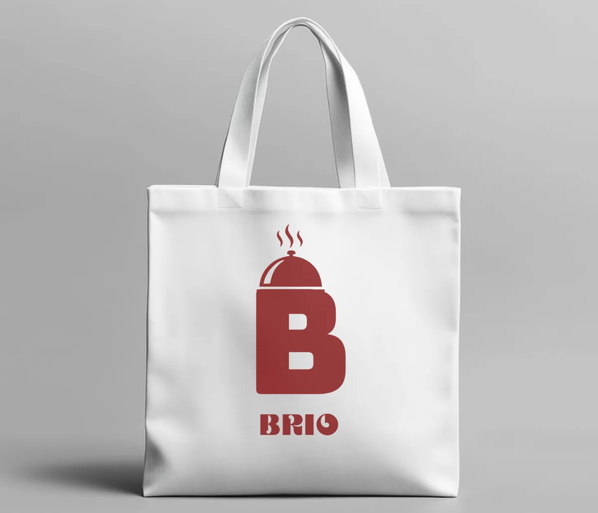
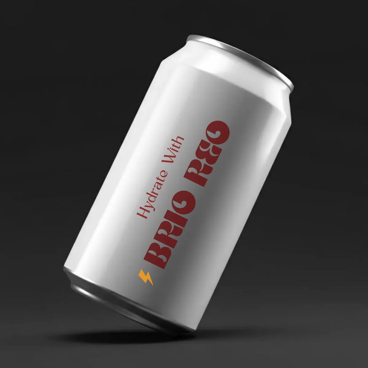
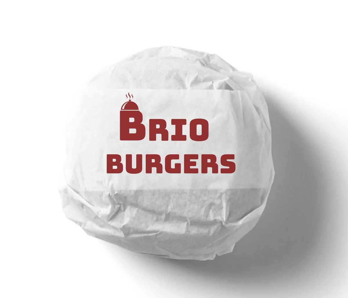
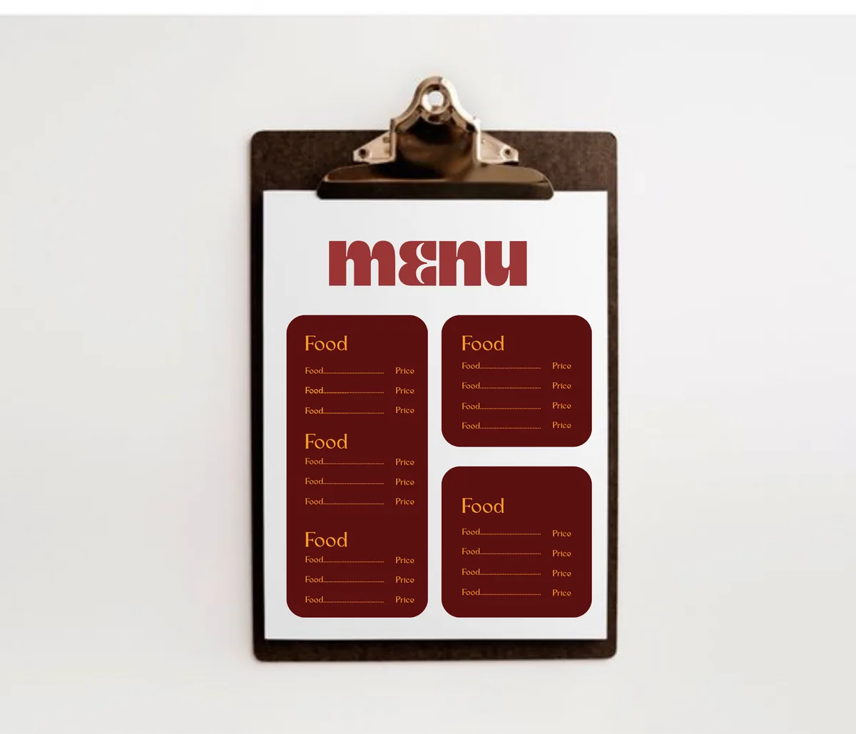
A complete identity system for the restaurant, applied across signage, mockups and social templates so every touchpoint reads as one brand.
Deliverables
Logo, colour palette, typography (Bungee), guidelines, mockups and social templates.
Colours